luma
A modern, personal visual library for organizing and viewing photographs. A premium personal photo archive — a visual journal, a calm, modern photography workspace.
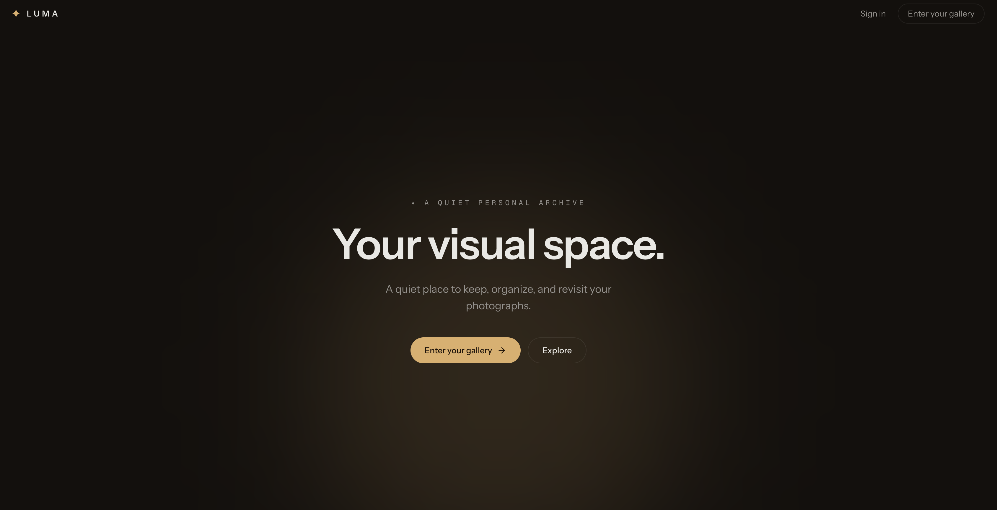
Luma
A modern photo gallery SaaS built for organizing and experiencing visual memories.
Role: Frontend Developer / Full-Stack Developer Type: SaaS Web Application Stack: Next.js, React, TypeScript, Tailwind CSS, shadcn/ui, Apollo Client, GraphQL, NestJS, MongoDB, Cloudinary, Vercel, Render
Overview
Luma is a modern photo gallery SaaS designed to give users a beautiful and organized space for managing their personal photo collections.
Instead of treating a photo library like a traditional file manager, Luma focuses on the visual experience. Photos are presented through an editorial-style masonry gallery, allowing users to browse their memories naturally while still having the tools needed to organize photos into albums.
The application combines a modern Next.js frontend with a NestJS GraphQL backend, MongoDB for application data, and Cloudinary for image storage and delivery.
The Problem
Traditional photo management interfaces often prioritize folders, lists, and file operations rather than the photos themselves.
For a visual product, the interface should make the images the primary experience.
The goal behind Luma was to create a gallery that feels:
- Visual-first
- Simple and intuitive
- Fast when browsing large collections
- Easy to organize
- Responsive across devices
- Modern without becoming visually overwhelming
The challenge was to create a product that feels closer to a premium visual archive than a conventional file-management application.
The Goal
The primary goal was to design and build a photo management experience where users can quickly:
- View their photo collection
- Upload and manage photos
- Organize photos into albums
- Browse individual images
- Manage photo information
- Navigate between collections effortlessly
At the same time, the frontend needed to remain maintainable and scalable as the application grew.
Design Direction
The visual direction was inspired by editorial photography and modern digital archives.
Instead of copying existing Pinterest-style layouts, Luma uses a more restrained visual language:
Editorial Masonry
Photos become the primary visual element while the surrounding interface stays quiet and minimal.
Design principles
- Image-first interface
- Generous whitespace
- Subtle rounded corners
- Minimal borders
- Clean typography
- Soft hover interactions
- Responsive masonry layout
- Light and dark modes
- Minimal visual distractions
The objective was to make the interface feel premium without relying heavily on gradients, glassmorphism, or excessive animation.
Key Features
Masonry Photo Gallery
The main gallery uses a responsive masonry layout to preserve the natural aspect ratios of photos.
This creates a more dynamic browsing experience than forcing every image into the same fixed dimensions.
Thumbnail images are used for the gallery while larger image versions are reserved for detailed viewing.
Album Organization
Users can organize photos into albums instead of keeping everything inside one large collection.
Albums provide a simple way to separate different collections, events, trips, or categories.
Each album has its own gallery experience.
Photo Details
Individual photos can contain metadata such as:
- Title
- Description
- Dimensions
- Format
- Album
- Upload information
This makes the application useful not only as a gallery but also as a lightweight personal photo-management system.
Responsive Experience
The interface was designed to work across:
- Desktop
- Tablet
- Mobile
The masonry layout adapts to available screen width while maintaining the visual hierarchy of the gallery.
Light & Dark Mode
Luma supports both light and dark themes, allowing users to choose an environment that works better for browsing images.
The dark experience is particularly useful for viewing photographs with less surrounding visual distraction.
Technical Architecture
Luma uses a decoupled frontend and backend architecture.
┌──────────────────────┐
                │       Next.js        │
                │      Frontend        │
                └──────────┬───────────┘
                           │
                      GraphQL API
                           │
                ┌──────────▼───────────┐
                │       NestJS         │
                │       Backend        │
                └───────┬───────┬──────┘
                        │       │
                 ┌──────▼──┐ ┌──▼─────────┐
                 │ MongoDB │ │ Cloudinary │
                 │ Metadata│ │   Images   │
                 └─────────┘ └────────────┘
The frontend communicates with the backend through GraphQL using Apollo Client.
MongoDB stores application metadata while Cloudinary handles the actual image assets and optimized delivery.
This separation prevents large image files from being stored directly inside the database and allows the application to take advantage of a dedicated media delivery platform.
Frontend Architecture
The frontend was built with Next.js and TypeScript using the App Router.
The application is organized around reusable UI and feature components rather than placing all functionality inside individual pages.
src/
├── app/
│   ├── (auth)/
│   ├── (dashboard)/
│   └── layout.tsx
│
├── components/
│   ├── layout/
│   ├── gallery/
│   ├── albums/
│   ├── ui/
│   └── providers/
│
├── graphql/
│   ├── queries/
│   └── mutations/
│
├── lib/
└── types/
This structure keeps gallery functionality, album functionality, UI components, and API operations separated and easier to maintain.
Why GraphQL?
GraphQL was chosen as the communication layer between the frontend and backend because the gallery requires different combinations of photo and album data.
For example, the frontend can request only the fields required by a particular screen instead of receiving an unnecessarily large response.
Apollo Client also provides a centralized way to manage GraphQL operations and cache application data.
Image Performance
One of the biggest technical considerations was image performance.
A photo gallery can quickly become expensive to load because high-resolution images can be significantly larger than the content required for a thumbnail.
Luma therefore separates image usage:
Gallery
Uses optimized thumbnail versions.
Photo Viewer
Uses larger versions when the user actually opens a photo.
Cloudinary
Handles image storage, transformations, optimization, and delivery.
This follows a common pattern for performant Next.js image galleries, where different image sizes are delivered depending on how the image is being displayed.
Challenges
1. Maintaining Visual Quality While Improving Performance
High-resolution photography looks beautiful but can negatively affect page performance.
The solution was to avoid loading the original image everywhere and instead use optimized versions appropriate for each UI context.
2. Designing Masonry Without Losing Responsiveness
A masonry gallery needs to handle photos with different aspect ratios while still looking balanced across screen sizes.
The layout was designed around responsive columns while allowing each image to maintain its natural proportions.
3. Keeping the UI Minimal
Photo applications can easily become cluttered with controls.
Luma intentionally keeps secondary actions hidden until they are relevant, allowing the photographs to remain the primary focus.
4. Separating Media From Application Data
Images can become one of the largest parts of a photo application.
Instead of storing image binaries inside MongoDB, Luma stores image metadata and Cloudinary references in the database while Cloudinary handles the media itself.
This creates a cleaner separation between application data and media storage.
Deployment
The application uses a split deployment architecture.
Frontend
Next.js → Vercel
Backend
NestJS → Render
Database
MongoDB
Media
Cloudinary
This architecture allows the frontend and backend to be deployed and scaled independently.
What I Learned
Building Luma provided several useful engineering lessons beyond simply creating a photo gallery.
Performance is part of UI design
A beautiful gallery is not enough if users have to wait for every image to load.
Image sizing, delivery, lazy loading, and CDN usage need to be considered from the beginning.
Architecture should follow the product
Separating the frontend, API, database, and media storage made the application easier to reason about and gave each part a clear responsibility.
Visual products require restraint
The biggest design challenge was not adding more UI, but deciding what could be removed.
By keeping controls minimal and giving the images more space, the application feels more focused and intentional.
Result
Luma became a modern, full-stack photo gallery experience that combines a visually focused interface with a scalable technical architecture.
The project demonstrates experience with:
- Next.js App Router
- React
- TypeScript
- Tailwind CSS
- shadcn/ui
- GraphQL
- Apollo Client
- NestJS
- MongoDB
- Cloudinary
- Responsive UI
- Image optimization
- SaaS architecture
- Vercel deployment
- API integration
More importantly, the project demonstrates how product design, frontend architecture, backend services, and performance considerations can work together to create a cohesive user experience.
Final Takeaway
Luma is more than a photo gallery.
It was built as an exploration of how a modern SaaS product can combine strong visual design with practical engineering — creating an experience where the technology stays behind the scenes and the user's photos remain the focus.